Today’s essential question: What makes a business card eye catching and memorable?
Today we will:
- Discuss the basic information that should be included on a business card.
- Learn some of the basic composition rules when designing a business card.
- Evaluate whether a business card design is good or bad.
- Begin thinking about a personal business card design that uses our logo.
Business Card Basics:
When designing business cards, there is some basic information that should be on ALL business cards. Modern business cards might use a QR Code to access this basic information in an effort to make a clean, simple business card, but you want to be careful doing that, especially if your audience is an older generation that might not know how to use QR Codes.
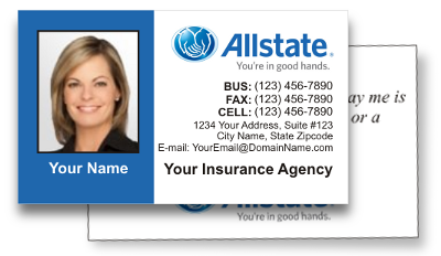
The above example is a pretty standard insurance business card. It contains the following standard information:
- Company Name
- Company Logo
- Business Phone
- Fax Number
- Cell Phone
- Mailing Address
- Email. Address
Depending on the company and/or person the business card is for, this additional information is sometimes necessary on a business card:
- Website
- Shorten your website name! Use TinyURL to shorten any long website.
- Photograph of person
- Business Hours
Optional information that can be included on a business card may include:
- Social Media Information
- Tagline or company slogan
- Physical Address
- In some cases, a physical address can be optional, particularly if your business operates all online.
- Not having a physical address listed, however, may sometimes signal that a card or company might be a scam.
Business Card Do’s:
When designing a business card, be sure to use some of the following advice:
- Keep it simple!
- No need to choose super fancy fonts just because they are there.
- Negative space is a good thing! Remember, a business card is SMALL!
- Font Choice is Important!
- Don’t choose overly fancy fonts that are hard to read.
- Make sure your font size is large enough to read on the small card.
- Make sure your font color doesn’t blend into the background.
- Use the back of the card!
- Nothing says everything needs to be on the front of a card.
- Depending on the company you are creating it for, use the back for:
- Small calendar
- Appointment Reminder
- Bio about the company
- Company slogan
- Website
- Directions to the physical address
- Be organized!
- Structure your card so similar information is together.
- Use your logo as a focal point.
- Properly center and align text.
- Include CORRECT information!
- Proofread before printing!
- Make sure contact information is correct.
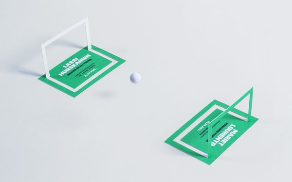
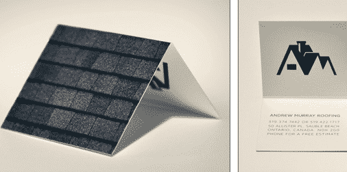
- Include fun embellishments and/or details that make your card memorable.
- Dentist? Add some floss!
- Make a play on words!
- Use non-traditional business card material or colors.
- Make it interactive!

Business Card Don’ts:
When designing a business card, be sure to avoid doing the following:
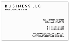
- Don’t be too boring!
- Be careful that it isn’t too plain!
- You want people to be drawn to your business card.
- Stay away from using common clipart and pre-made designs.
- Don’t use designs that other companies might use!
- Your card will not stand apart from competitors who might use the same designs.
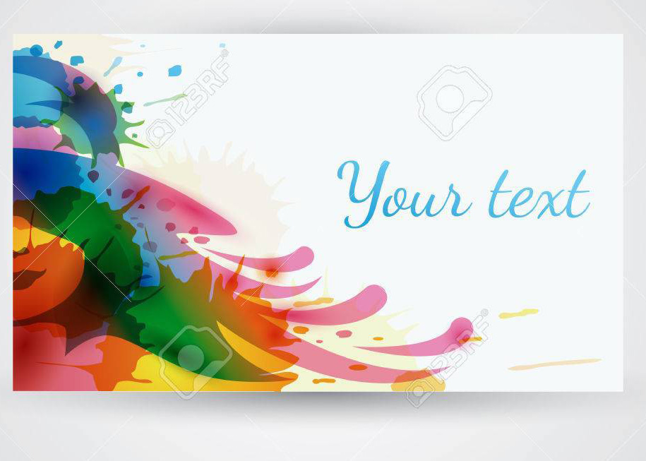
- As great as this watercolor design is, it’s very common to see this on business cards!
- Don’t overcrowd your business card!
- If you have too much going on, it will make it hard to read.
- Don’t use more than 2 or 3 types of fonts.
- One font can be a bit fancy as a heading.
- The other font should be simple and easy to read.
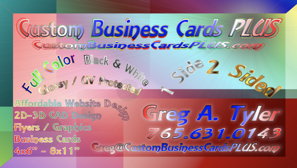
- Don’t use too many colors.
- Too many colors can overwhelm the viewer and make it harder to read the words.
- If you do use a larger color palette, be sure to limit where the colors will be.
- Don’t be inappropriate!
- Yes, you are going to be advertising to a certain clientele, but be sure to make your card appropriate!
- You don’t want to scare away other customers! Font choice and clip art is important for this!
- In the business world, you need to remain professional.

- Don’t be obnoxious!
- Overconfidence can be seen as arrogance and will scare people away.

- Overconfidence can be seen as arrogance and will scare people away.
Blog Post:
Now that you’ve read through some business card design do’s and don’ts, it’s time to reflect on some business card designs. There are 7 questions and images in this document you need to copy and paste into a blog post. You will probably need to resize the images after you paste them into your blog post to make them smaller. Answer those questions completely and submit your blog post to me in Schoology.
